
A Valentine’s Day Case Study: Storytelling Through Brand Photography for Ritual Clay Company
Product photography does more than show what something looks like. When done well, it tells a story about care, intention, and experience. For Ritual Clay Company’s 2023 Valentine’s Day campaign, my goal was not to photograph products in isolation, but to photograph a feeling. Something intimate, thoughtful, and quietly luxurious.
Ritual Clay Company was a pottery and gift shop rooted in slow craft. Every apothecary item was made in house using high quality natural ingredients, and every seasonal collection was designed to feel personal rather than mass produced. Valentine’s Day was a natural extension of that philosophy, but we intentionally avoided the usual tropes.
This campaign became a case study in how I approach storytelling through brand photography.

Starting With the Story, Not the Shot List
Before I picked up a camera, I asked one question:
What should this feel like?
Valentine’s Day marketing often leans loud, glossy, or overly staged. That did not fit Ritual Clay Company. Instead, we leaned into softness, ritual, and quiet romance. The idea was less “holiday promotion” and more “a moment you give to someone you love.”
That story informed every visual decision. The color palette stayed muted and warm. Textures were tactile and imperfect. Light was soft and directional, mimicking early morning or late afternoon rather than studio brightness.One of my favorite images from the set shows a wrapped gift bundle held behind someone’s back. You never see their face. You do not need to. The story is clear.

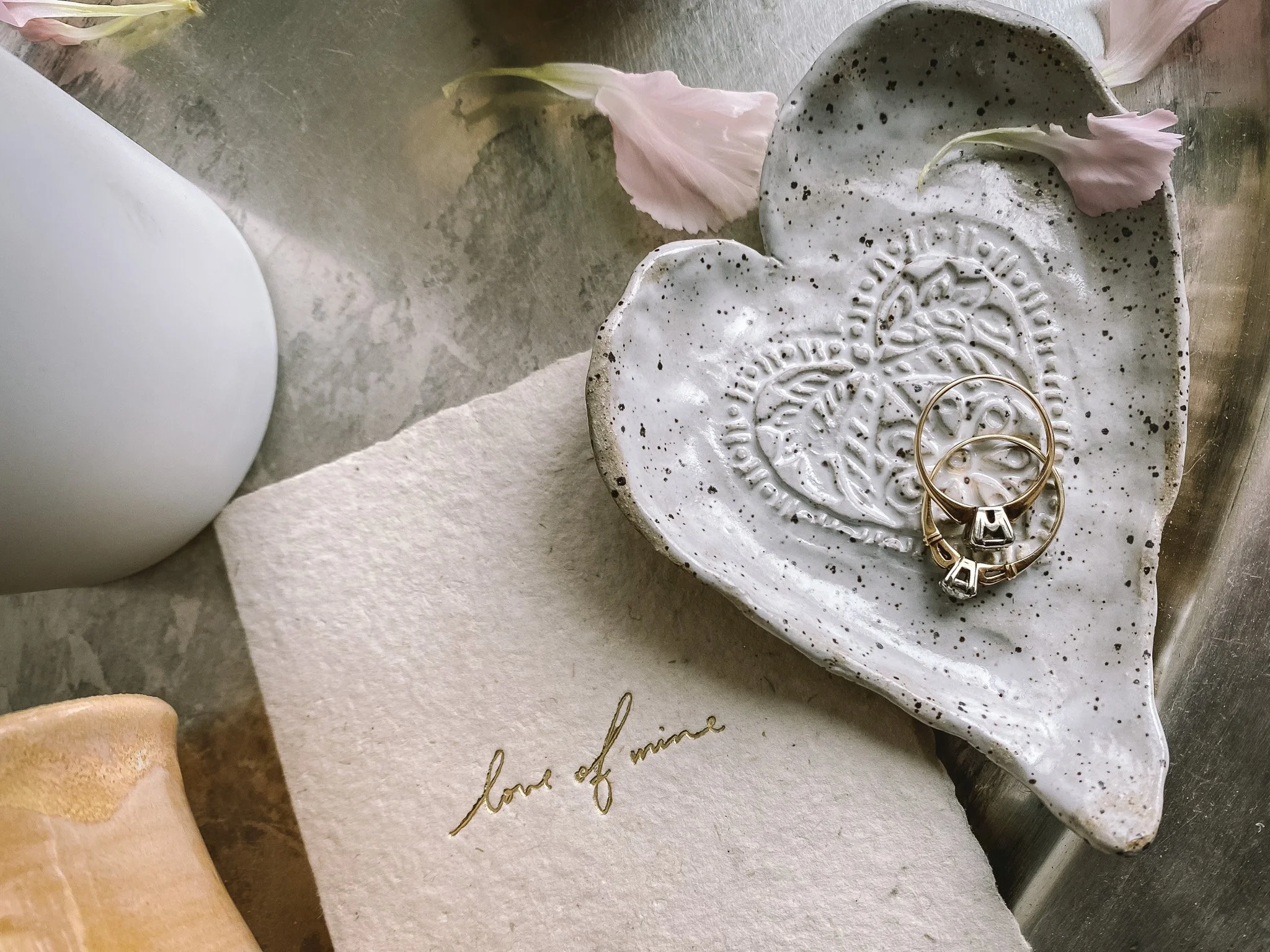

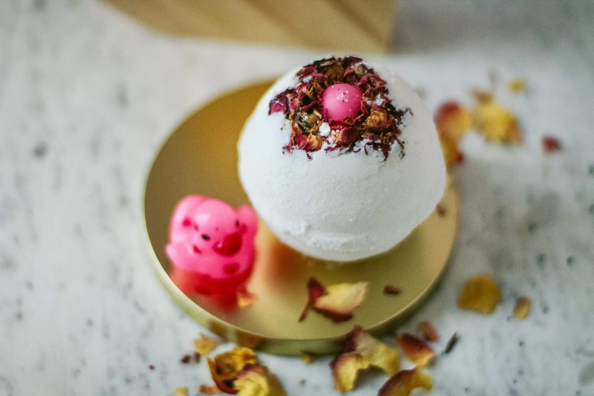
Photographing Products as Objects of Ritual
The apothecary products were photographed as objects meant to be used, not just displayed.
Hand and body lotion bottles were styled with natural elements like dried botanicals and raw crystals, reinforcing the idea of care and intention. Soap bars were photographed mid use, with gentle bubbles and scattered lavender buds, so they felt alive rather than pristine. Bath bombs were shown cracked open, revealing texture and color, inviting the viewer to imagine the experience rather than just the object.
This approach helps customers mentally place themselves into the moment. They are not just buying a product. They are buying the pause that comes with it.


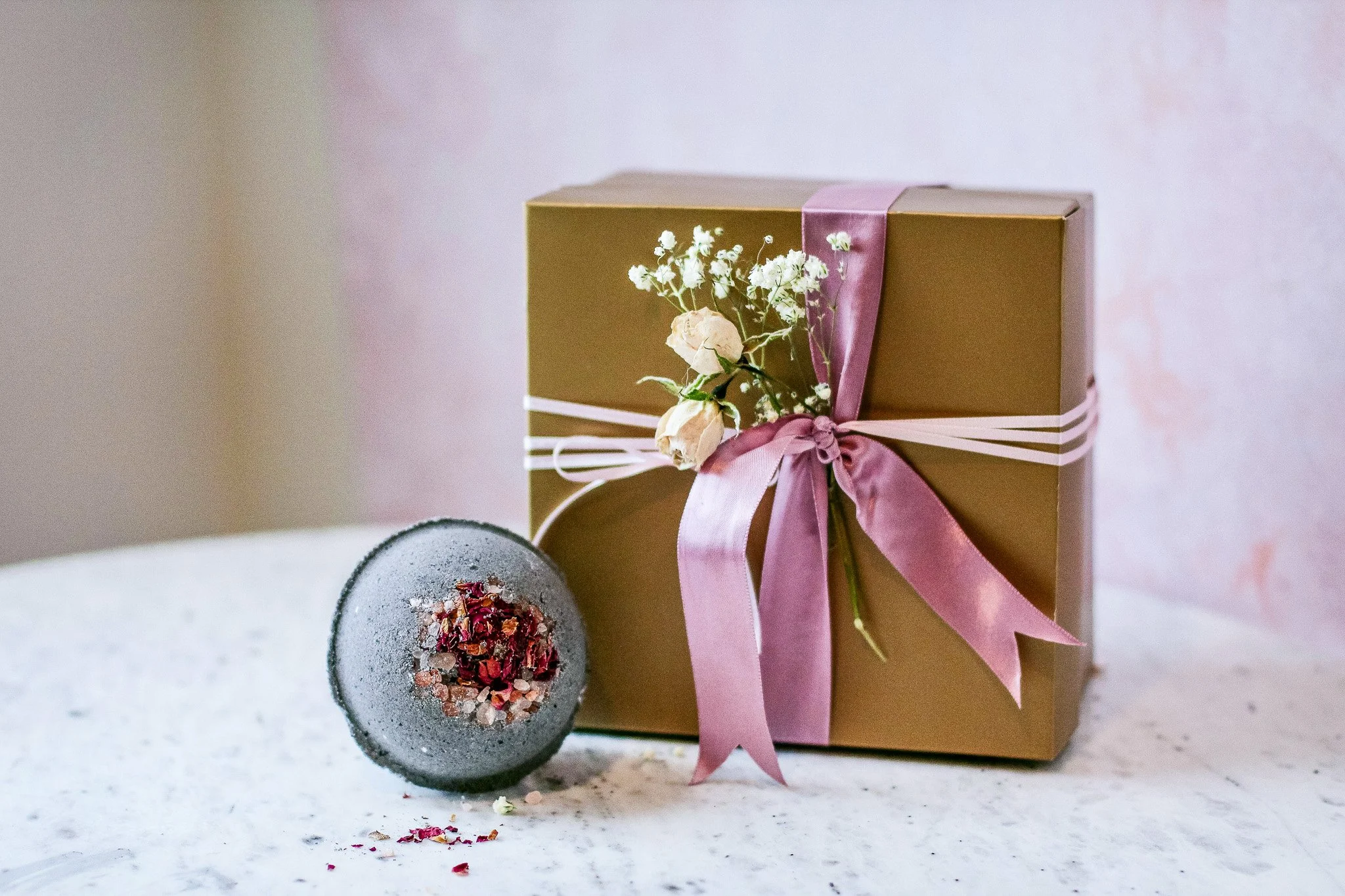
Why Imperfection Matters in Brand Photography
A key part of my approach is allowing imperfection to remain visible.
A slightly uneven ribbon. Loose petals on a surface. A soap bar with softened edges. These details matter. They signal care, not carelessness. They tell the viewer that real hands were involved.
For brands rooted in craft, over polishing can do more harm than good. Customers who value handmade goods are often looking for evidence of process. Photography should support that, not erase it.

Lighting, Texture, and Space
Technically, this campaign relied heavily on natural light and shallow depth of field. Backgrounds were intentionally soft and textured, allowing products to feel grounded without competing for attention.
Negative space played a big role. Not every image needed to be full. Some needed room to breathe. That made the collection easier to use across web, email, and social platforms without losing cohesion. It also afforded us the ability to add text to images in post-production.


Results and Takeaways
The 2023 Valentine’s Day campaign performed strongly because it felt different. Customers responded to the emotion of the images as much as the products themselves. The photography supported storytelling across the website, email campaigns, and social media without needing heavy explanation.
The biggest takeaway is this: good brand photography starts with empathy. When you understand how a product fits into someone’s life, the visuals almost design themselves.
This approach is how I work with brands today. Whether I’m photographing products, spaces, or people, I focus on story first, aesthetics second. The goal is always the same. Create images that feel human, intentional, and worth lingering on.